En:Meracie komponenty: Rozdiel medzi revíziami
| (3 medziľahlé úpravy od rovnakého používateľa nie sú zobrazené.) | |||
| Riadok 29: | Riadok 29: | ||
</div> | </div> | ||
| − | + | <div itemscope itemtype="http://schema.org/SoftwareApplication"> | |
| − | {| class=" | + | {| class="prettytable" |
| − | | | + | | Name || <span itemprop="name">MeasureComponents (info.kiwiki.measurelib)</span> |
| + | |- | ||
| + | | Type || <span itemprop="applicationCategory">Library</span> | ||
| + | |- | ||
| + | | Verzia || <span itemprop="version">1.1</span> | ||
|- | |- | ||
| − | | | + | | Platform || <span itemprop="operatingSystem">Android</span> |
|- | |- | ||
| − | | | + | | Description || <span itemprop="description">Library with graphical componnets for using in industrial applications.</span> |
|- | |- | ||
| − | | | + | | Download || [http://www.kiwiki.info/files/android/measlib.jar measlib.jar] |
|- | |- | ||
| − | | | + | | Author || <span itemprop="author" itemscope itemtype="http://schema.org/Person"><span itemprop="name">Juraj Ďuďák</span> ([[Redaktor:Juraj]])</span> |
|} | |} | ||
| + | </div> | ||
__NOTOC__ | __NOTOC__ | ||
| Riadok 58: | Riadok 63: | ||
* '''Text''' - simple display value as a text with possibility of value change by KeypadWidget. | * '''Text''' - simple display value as a text with possibility of value change by KeypadWidget. | ||
| − | [[Súbor:measurelib_ico.png|link=En:MeasureDemo]] For demostration of components from '' | + | [[Súbor:measurelib_ico.png|link=En:MeasureDemo]] For demostration of components from ''info.kiwiki.measurelib'' library, the demo apllication is prepared. Detailed description, screenshots and video is on [[En:MeasureDemo|measureDemo]] page. |
| + | |||
| + | |||
| + | '''Gallery''' | ||
| + | <gallery> | ||
| + | Súbor:Meter1.png|Meter|link=Meracie komponenty:Meter | ||
| + | Súbor:Pointer6.png|Pointer|link=Meracie komponenty:Pointer | ||
| + | Súbor:Seven1.png|SevenSegment|link=Meracie komponenty:SevenSegment | ||
| + | Súbor:Switch1.png|Switch|link=Meracie komponenty:Switch | ||
| + | Súbor:Termometer3.png|TermoMeter|link=Meracie komponenty:TermoMeter | ||
| + | Súbor:Status6.png|Status|link=Meracie komponenty:Status | ||
| + | Súbor:Direction3.png|DirectionArrow|link=Meracie komponenty:DirectionArrow | ||
| + | Súbor:Measuring components text1.png|Text|link=Meracie komponenty:Text | ||
| + | </gallery> | ||
| − | |||
| − | |||
==Detailed description of library== | ==Detailed description of library== | ||
| Riadok 74: | Riadok 90: | ||
Each component contains a title, additional text and graphical representation of itself. Each component graphically illustrates a numerical value, which is limited to the lower (minimum) and upper (maximum) limit. The value of this scale is divided these parts: a negative value, the normal value, warning value and critical value. All graphic components can change color performance prepared in 4 themes: android style, dark style, pastel style and green-yellow style. | Each component contains a title, additional text and graphical representation of itself. Each component graphically illustrates a numerical value, which is limited to the lower (minimum) and upper (maximum) limit. The value of this scale is divided these parts: a negative value, the normal value, warning value and critical value. All graphic components can change color performance prepared in 4 themes: android style, dark style, pastel style and green-yellow style. | ||
| − | ===Class | + | ===Class BaseComponent === |
| − | [[Súbor:Meraci_komponent_class.png|náhľad|Class | + | [[Súbor:Meraci_komponent_class.png|náhľad|Class BaseComponent]] |
====Property: label==== | ====Property: label==== | ||
| Riadok 176: | Riadok 192: | ||
Use of callback: | Use of callback: | ||
<source lang="java"> | <source lang="java"> | ||
| − | // komponent je instancia triedy | + | // komponent je instancia triedy BaseComponent alebo jeho potomka |
komponent.callback = new ComponentCallback(){ | komponent.callback = new ComponentCallback(){ | ||
public void OnValueChanged(double value) { | public void OnValueChanged(double value) { | ||
Aktuálna revízia z 10:42, 27. jún 2013
Measuring Componets
| Language EN [[{{#sub:En:Meracie komponenty|3|{{#len:En:Meracie komponenty}}}}|SK]] | Navigation: | Projects -> Measuring Componets -> MeasureDemo |
| Name | MeasureComponents (info.kiwiki.measurelib) |
| Type | Library |
| Verzia | 1.1 |
| Platform | Android |
| Description | Library with graphical componnets for using in industrial applications. |
| Download | measlib.jar |
| Author | Juraj Ďuďák (Redaktor:Juraj) |
Library content
MeasureComponents package is library of visual components for application development on Android platform. The library consist of these components:
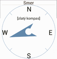
- DirectionArrow - for direction visualization (e.g. direction of wind,...)
- Keypad - simple entering numerical values
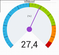
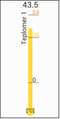
- Meter - analog meter
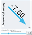
- Pointer - show trend. Suiteble for derivation visualization
- Progress - similar to Progress in Android
- SevenSegment - 7 segment display with custom number of displayed digints.
- Slider - similar to Slider in Adnroid
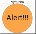
- Status - visual state indicator
- Switch - similar to Switch in Android
- TermoMeter - Suitable for temperature visualization.
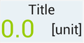
- Text - simple display value as a text with possibility of value change by KeypadWidget.
 For demostration of components from info.kiwiki.measurelib library, the demo apllication is prepared. Detailed description, screenshots and video is on measureDemo page.
Gallery
Meter
Pointer
SevenSegment
Switch
TermoMeter
Status
DirectionArrow
Text
Detailed description of library

Platform
- Minimal Android API version: 8 (FroYo)
- From API 11 (Honeycomb) is change of value animated.
Common properties of all components
Each component contains a title, additional text and graphical representation of itself. Each component graphically illustrates a numerical value, which is limited to the lower (minimum) and upper (maximum) limit. The value of this scale is divided these parts: a negative value, the normal value, warning value and critical value. All graphic components can change color performance prepared in 4 themes: android style, dark style, pastel style and green-yellow style.
Class BaseComponent

Property: label
The property 'label' defines the label name of the component. Usually the name shown at the top of the component. Name size is proportional to the size of the component.
Methods:
setlabel Sets the text to be displayed as the name of the component. If the name is longer than the width of component, component name is truncated.
public void setLabel(String l)
getLabel
Returns the name of the component.
public String getLabel()
Property: label2
Label2 property defines additional text. The intended use is to display additional properties of displayed value. The size and location of an additional text related to the size and format of the component
Methods:
setLabel2, getLabel2
    public void setLabel2(String l)
    public String getLabel2()
Property: value
Property 'value' represents the displayed value. The value can range from min to max.
Methods:
setValue, getValue
    public void setValue(double v)
    public double getValue()
Properties: minimum, maximum
These properties determine the range of displayed value.
Methods:
setMin, setMax, getMin, getMax
    public void setMin(double m)
    public void setMax(double m)
    public double getMin()
    public double getMax()
Properties: warning, alert
These properties determine the range of displayed values .
Methods:
setWarning, setWarningPercent, setAlert, setAlertPercent Using these methods, you can set the value of warning/alert by directly entering value x ( minimum < x < maximum) or enter a percentage of the maximum range.
    public void setMin(double m)
    public void setMax(double m)
    public double getMin()
    public double getMax()
Property: colorTheme
This property specifies a color style of component.
Methods:
setColorTheme
ColorTheme property can have a value from the set:
- ComponentStyle.THEME_ANDROID
- ComponentStyle.THEME_DARK
- ComponentStyle.THEME_PASTEL
- ComponentStyle.THEME_CITRUS
public void setColorTheme(int colorTheme)
Property: valueChanged
ValueChanged property is an instance of the interface ComponentCallback and it is used for notification of component value change. Callback method is invoked when the component value was changed.
Use of callback:
// komponent je instancia triedy BaseComponent alebo jeho potomka
komponent.callback = new ComponentCallback(){
    public void OnValueChanged(double value) {
		// nejaka akcia, napr ovladanie ineho komponentu
                }
   };